



Modern CSS Gradients That Don't Look Like a 2015 Website
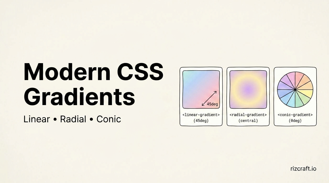
The default two-stop gradient — one color sliding into another — is the first thing most people reach for, and it's also the thing that makes a design feel a decade old. A few small adjustments make a real difference.
The three gradient types
/* linear - the default most people know */
background: linear-gradient(135deg, #2563EB, #7C3AED);

/* radial - expands from a center point */
background: radial-gradient(circle at top left, #2563EB, #0F172A);

/* conic - sweeps around a center point, like a color wheel */
background: conic-gradient(from 90deg, #2563EB, #7C3AED, #2563EB);
Conic gradients are the one most people forget exists, and they're genuinely useful for things a linear or radial gradient can't do cleanly — a progress ring, a color-wheel picker, a pie-chart-style visual, all without a single line of JavaScript.
The muddy-middle problem
Blend red directly into blue and the middle of the gradient turns a flat, muddy purple-grey — not the vivid violet you'd expect. This happens because standard CSS gradients interpolate through RGB space by default, and RGB doesn't handle hue transitions the way your eye expects.
Two fixes:
Add an intermediate color stop that's actually the color you want to see in the middle:
background: linear-gradient(135deg, #2563EB, #7C3AED, #EF4444);Or specify a different interpolation color space — a CSS feature with solid modern browser support:
background: linear-gradient(in oklch, #2563EB, #EF4444);oklch and hsl both interpolate through hue rather than raw RGB values, keeping the transition looking like a genuine color blend instead of a grey smear. Worth a quick caniuse check before relying on it for a critical design element if the page needs to hold up on older browsers.
Making it feel less flat
A single gradient behind a solid block of content reads as decoration. A couple of adjustments make it feel more intentional:
- Add grain or noise on top of a smooth gradient — even a subtle amount breaks up the flatness that makes gradients look artificial, especially on larger backgrounds
- Use gradients as accents, not backgrounds — a gradient border, a gradient text fill (
background-clip: text), or a gradient behind just one element reads as more deliberate than a full-page gradient wash - Keep the angle purposeful — 135deg (top-left to bottom-right) reads as the most natural default; a straight 90deg or 180deg often looks more mechanical than intended
Building one without doing the math
The CSS Gradient Generator lets you design linear, radial, and conic gradients with a live preview and copies out clean CSS — faster than eyeballing hex values and angle degrees by hand, and it saves you from committing a muddy-middle gradient to production without noticing until it's live.